Revenue bridge
A revenue bridge (or sales bridge) walks from the revenue of a baseline period to the revenue of the current period, one explanation at a time. It is usually drawn as a waterfall chart: two full bars for the two periods, and floating bars in between for each effect that pushed revenue up or down.
Reading the waterfall
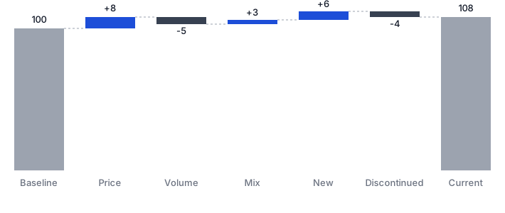
Start at the left bar (baseline revenue). Each floating bar adds or removes value: Price effect first, then Volume effect, Mix effect, New products and Discontinued. The right bar is the current revenue. If the steps don't land exactly on the final bar, the bridge is not reconciled — and should say so.
In the example above, the bridge starts from a baseline revenue of 100. Price changes add 8, selling fewer units takes away 5, a richer product mix adds 3, launches bring 6 and delistings remove 4 — landing exactly on the current revenue of 108. Five short stories instead of one unexplained number: that is what makes the waterfall the standard way to present a revenue bridge to management.
Your own file may show more than five bars. When you map product categories, the mix effect splits into a category mix and a within-category mix; when you provide gross revenue as well as net, the price effect splits into a gross price effect and a discount effect. Each split still sums to the effect it refines, so the bridge reconciles exactly.
Where bridges usually go wrong
- New and discontinued products mixed into price or volume. A product with no baseline has no price change — it belongs in its own effect.
- Mix ignored. Selling the same units at the same prices, but more of the cheap product, lowers revenue. Without a mix effect, that loss gets blamed on price or volume.
- Silent conventions. Price effects can be valued at baseline or current volumes; the total is the same but the split differs. The convention used here — current volumes — is stated in the app, not hidden.
- No reconciliation test. If the effects don't add up to the observed change, the bridge is wrong. This tool checks it to the cent, on every run.
Build one from your sales export
Drop a CSV or Excel file with a period, product, quantity and revenue column. You get a reconciled waterfall, a drill-down table from total to category to SKU, top movers, and Excel / PNG exports — entirely inside your browser, with nothing uploaded anywhere.
Build your bridge — free, runs in your browser
Related reading: the five effects in detail · doing the same on gross margin